In CSS, the display property determines how an element looks. It is also a crucial part of the presentation of you HTML code as it has a significant impact on layouts.
In fact, to use the modern Flexbox and Grid models, you need to use the display property before you get access to their various properties and values. This is one reason why the display property is so important in CSS.
Let’s dive in and learn how to use the display property and all its different values.
Tóm Tắt
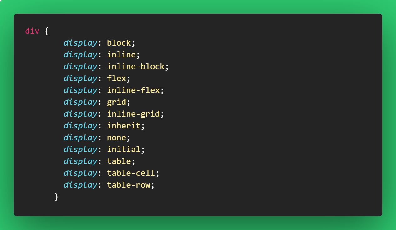
Basic display Property Syntax
element {
        display: value;
     }
Display Property Values in CSS
There are inline and block-level elements in CSS. The difference between the two is that inline elements don’t take up an entire space – that is, they don’t start on a new line – but block elements do.
The display property takes many different values such as inline, inline-block, block, table, and more, which all influence the layout and presentation of an element on the web page. Also, to implement the flex and grid layouts, you need to use the display property.
You can use this display property to change an inline element to block, block element to inline, block and inline elements to inline-block, and many more.
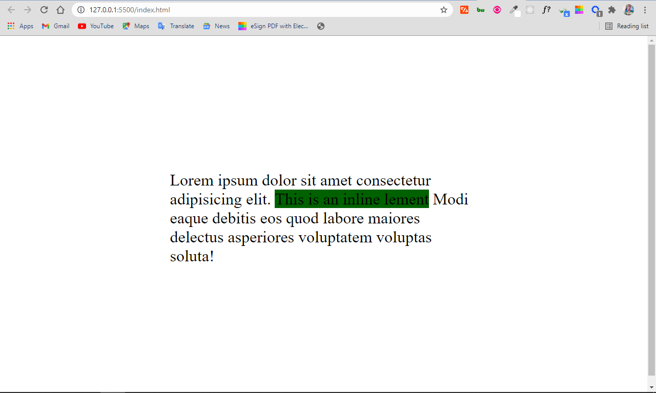
display: inline
An element with a display property set to inline will not start on a new line and it will take up the remaining/available screen width. It just takes up the space such an element would normally take.
Because of this, you can’t set the width and height of an element that has a display of inline, becuase it does not take up the whole screen width.
Some elements are inline by default, like <span>, <a>, <i>, and <img>.
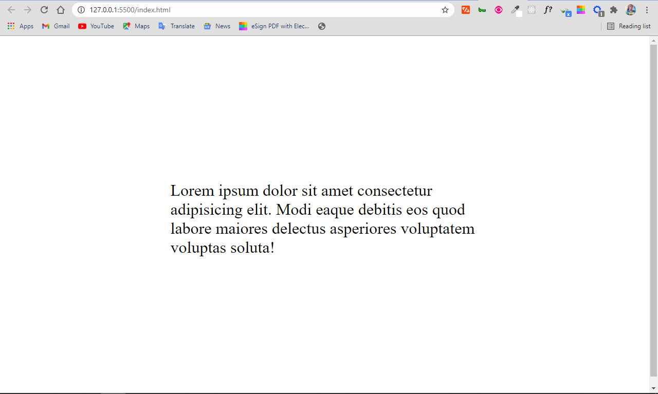
<div>
      Lorem ipsum dolor sit amet consectetur adipisicing elit.
      <span>This is an inline lement</span> Modi eaque debitis eos quod labore
      maiores delectus asperiores voluptatem voluptas soluta!
</div>
 body {
        display: flex;
        align-items: center;
        justify-content: center;
        height: 100vh;
        font-size: 2rem;
      }
div {
        max-width: 600px;
      }
span {
        background-color: #006100;
      }
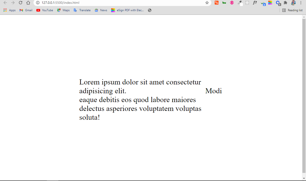
display: block
An element that has the display property set to block starts on a new line and takes up the available screen width.
You can specify the width and height properties for such elements. Examples of elements that are at block-level by default are <div>, <section>, <p>, and lots more.
You can set the span from the previous HTML code to block display and it will behave like a block-level element.
span {
        display: block;
        background-color: #006100;
      }
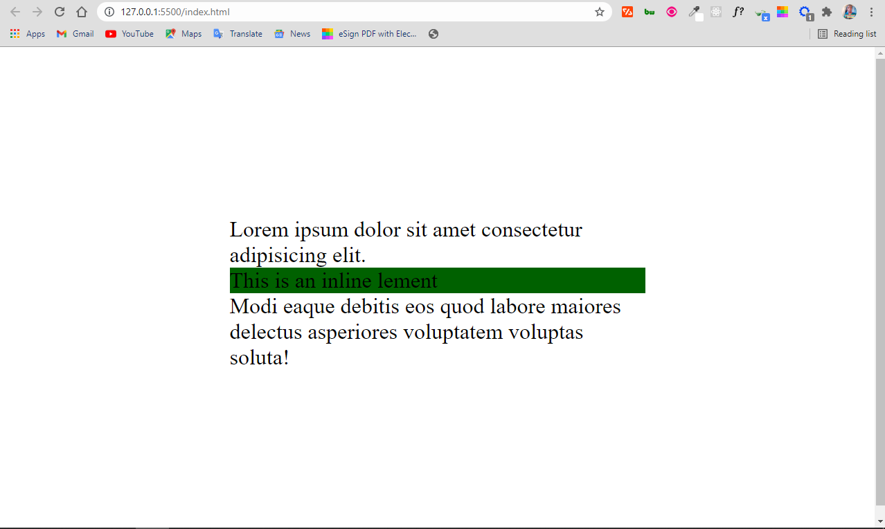
You can see that the <span> takes up the full width. That’s because it has a display property set to block.
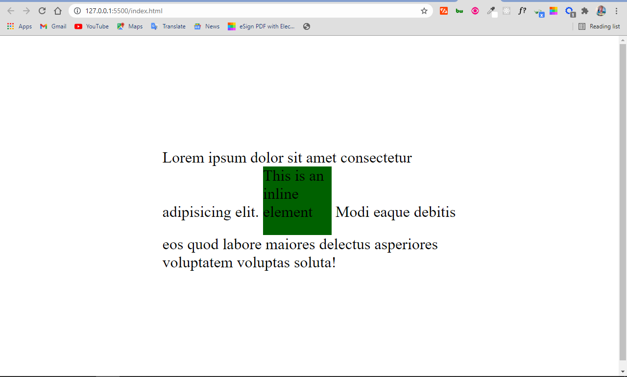
display: inline-block
Apart from block and inline display, there’s also inline-block.
An element you assign a display of inline-block is inline by presentation. But it has the added advantage of you being able to apply width and height to it, which you can’t do when the element is assigned a dispaly of inline.
So, you can look at the inline-block display as an inline element and block element in one package.
 span {
        display: inline-block;
        background-color: #006100;
        width: 140px;
        height: 140px;
      }
display: none
When you set the display property of an element to none, the element is completely taken off the page and it doesn’t have an effect on the layout.
This also means that devices like screen readers, which make websites accessible to blind people, wont’t have access to the element.
Do not confuse display: none with visibility: hidden. The latter also hides the element, but leaves the space it would normally take open or empty.
span {
        display: none;
        background-color: #006100;
        width: 140px;
        height: 140px;
      }
Visibility hidden leaves the space occupied by the span element open, as you can see below:
 span {
        visibility: hidden;
        background-color: #006100;
        width: 140px;
        height: 140px;
      }
display: table
You’ll rarely use a display value of table these days, but it’s still important to know. It was more useful in the past because you would use it for layouts before the advent of floats, Flex, and Grid.
Setting display to table makes the element behave like a table. So you can make a replica of an HTML table without using the table element and corresponding elements such as tr and td.
For example, in HTML, you can make a table with the <table> element and also a <div>, or any container of your choice.
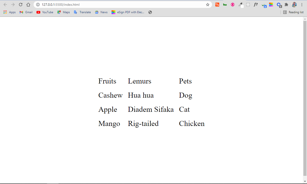
You make a table with the HTML <table> element like this:
<table>
      <tr>
        <td>Fruits</td>
        <td>Lemurs</td>
        <td>Pets</td>
      </tr>
      <tr>
        <td>Cashew</td>
        <td>Hua hua</td>
        <td>Dog</td>
      </tr>
      <tr>
        <td>Apple</td>
        <td>Diadem Sifaka</td>
        <td>Cat</td>
      </tr>
      <tr>
        <td>Mango</td>
        <td>Rig-tailed</td>
        <td>Chicken</td>
      </tr>
</table>
body {
    display: flex;
    align-items: center;
    justify-content: center;
    height: 100vh;
    font-size: 2rem;
}

div {
    max-width: 600px;
}

span {
    display: inline-block;
    background-color: #006100;
    width: 140px;
    height: 140px;
}

tr,
td {
    padding: 10px;
}
The result of the HTML and CSS code snippets above looks like this:
But you can make the same table with the <div> element by setting the respective displays to table, table-row, and table-cell. You will get the same result as you can see below:
 <div class="table">
      <div class="row">
        <div class="cell">Fruits</div>
        <div class="cell">Lemurs</div>
        <div class="cell">Pets</div>
      </div>
      <div class="row">
        <div class="cell">Cashew</div>
        <div class="cell">Hua hua</div>
        <div class="cell">Dog</div>
      </div>
      <div class="row">
        <div class="cell">Apple</div>
        <div class="cell">Diadem Sifaka</div>
        <div class="cell">Cat</div>
      </div>
      <div class="row">
        <div class="cell">Mango</div>
        <div class="cell">Ring-tailed</div>
        <div class="cell">Chicken</div>
      </div>
</div>
body {
    display: flex;
    align-items: center;
    justify-content: center;
    height: 100vh;
    font-size: 2rem;
}

div {
    max-width: 600px;
}

span {
    display: inline-block;
    background-color: #006100;
    width: 140px;
    height: 140px;
}

.table {
   display: table;
}

.row {
   display: table-row;
}

.cell {
   display: table-cell;
}

.row,
.cell {
  padding: 10px;
}
You still get your table:

Other values of the Display Property
Apart from inline, block, none, and table, which are really important because they significantly influence how web pages look, there are other values of the display property worthy of your attention.
Some of them you’ll use all the time without really realizing that they are also part of the display property. And others you won’t use often at all.
Let’s look at some of them now.
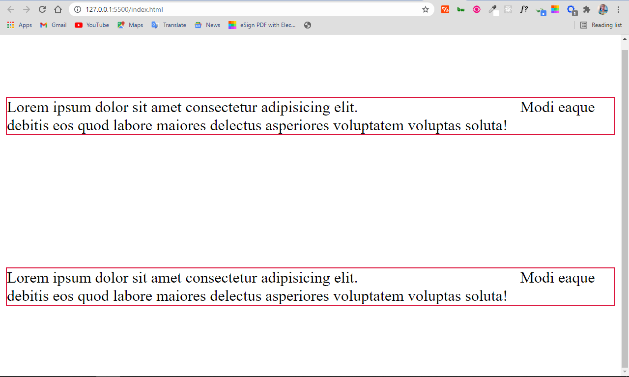
display: flex
A display of flex gives you access to the Flex layout system, which simplifies how we design and layout our web pages.
<div class="container">
      <div class="child">
        Lorem ipsum dolor sit amet consectetur adipisicing elit.
        <span>This is an inline element</span> Modi eaque debitis eos quod
        labore maiores delectus asperiores voluptatem voluptas soluta!
      </div>
      <div class="child">
        Lorem ipsum dolor sit amet consectetur adipisicing elit.
        <span>This is an inline element</span> Modi eaque debitis eos quod
        labore maiores delectus asperiores voluptatem voluptas soluta!
      </div>
</div>
.container {
        display: flex;
        align-items: center;
        justify-content: center;
        height: 100vh;
        font-size: 2rem;
}

span {
       visibility: hidden;
       background-color: #006100;
       width: 140px;
       height: 140px;
}

.child {
       border: 2px solid crimson;
       margin: 4px;
}
display: grid
A display set to grid allows you to build layouts with the grid system, which is like an advanced form of flex.
<div class="container">
      <div class="child">
        Lorem ipsum dolor sit amet consectetur adipisicing elit.
        <span>This is an inline element</span> Modi eaque debitis eos quod
        labore maiores delectus asperiores voluptatem voluptas soluta!
      </div>
      <div class="child">
        Lorem ipsum dolor sit amet consectetur adipisicing elit.
        <span>This is an inline element</span> Modi eaque debitis eos quod
        labore maiores delectus asperiores voluptatem voluptas soluta!
      </div>
</div>
.container {
        display: grid;
        place-items: center;
        height: 100vh;
        font-size: 2rem;
      }

span {
       visibility: hidden;
       background-color: #006100;
       width: 140px;
        height: 140px;
}

.child {
       border: 2px solid crimson;
       margin: 4px;
}
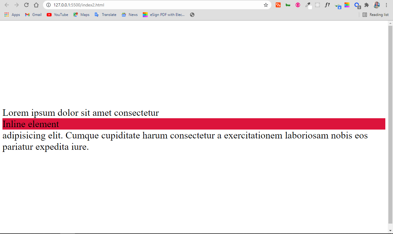
display: inherit
This makes the element inherit the display property of its parent. So, if you have a <span> tag inside a div and you give the span tag a display of inherit, it turns it from inline to block element.
<div>
      Lorem ipsum dolor sit amet consectetur
      <span>Inline element</span> adipisicing elit. Cumque cupiditate harum
      consectetur a exercitationem laboriosam nobis eos pariatur expedita iure.
</div>
body {
     display: flex;
     align-items: center;
     justify-content: center;
     height: 100vh;
     font-size: 2rem;
}

span {
     display: inherit;
     background-color: crimson;
}
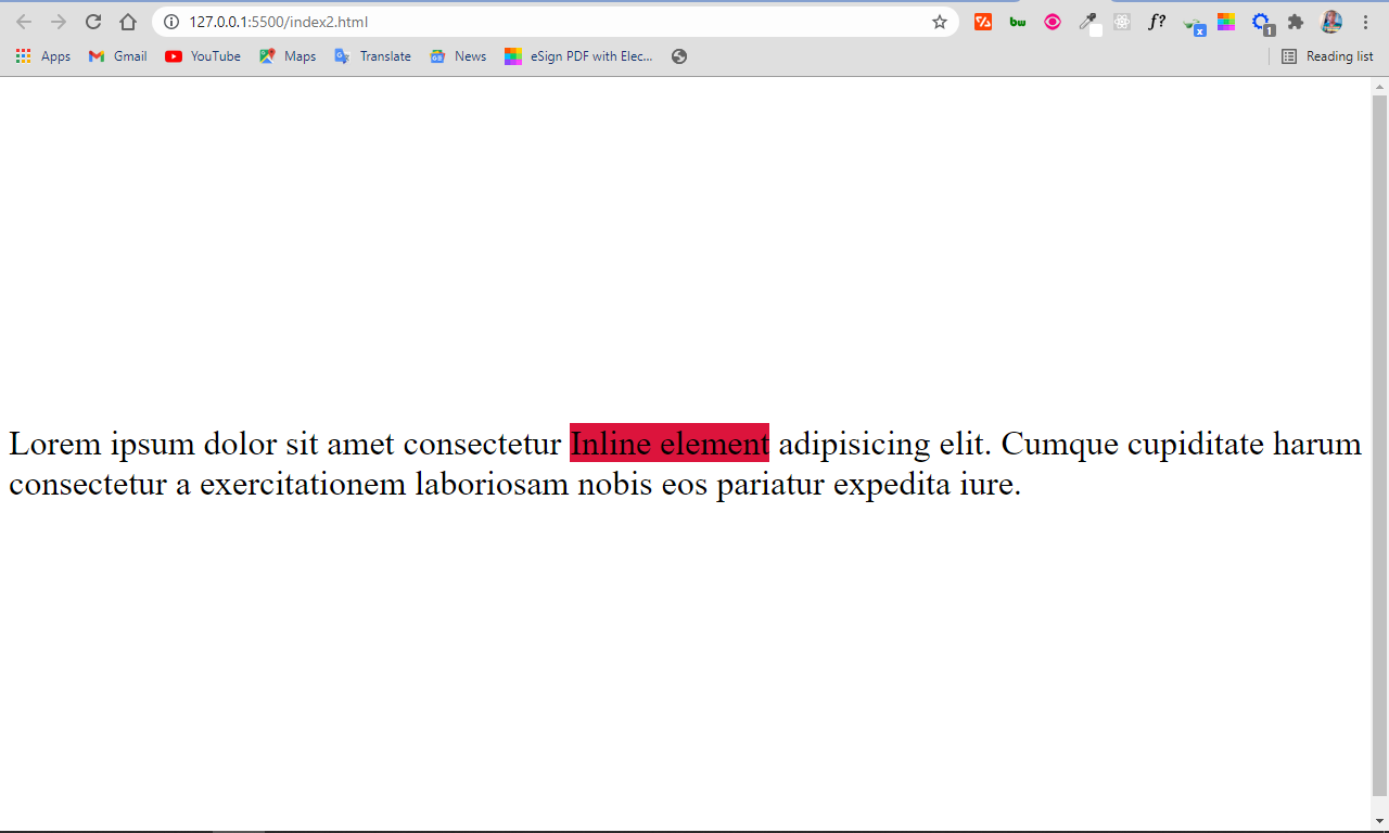
display: initial
This sets the display property of an element to its default value. So, if you set the display property of a span to initial, it remains inline, and if you set the same value for a div, it remains block.
<div>
      Lorem ipsum dolor sit amet consectetur
      <span>Inline element</span> adipisicing elit. Cumque cupiditate harum
      consectetur a exercitationem laboriosam nobis eos pariatur expedita iure.
</div>
body {
    display: flex;
    align-items: center;
    justify-content: center;
    height: 100vh;
    font-size: 2rem;
}

span {
    display: initial;
    background-color: crimson;
}
Conclusion
Having a good grasp of the display property will help your page layouts look great. It also gives you a lot more control over the way you present your elements while working with CSS.
You can continue to come back to this article for reference too as the display property is always confusing at first until you use it enough to understand it fully.
I hope this article has given you the background knowledge you need in order to put the display property to good use.
Thank you for reading, and keep coding.