CSS2 allows you to specify stylesheet for specific media type such as screen or print. Now CSS3 makes it even more efficient by adding media queries. You can add expressions to media type to check for certain conditions and apply different stylesheets. For example, you can have one stylesheet for large displays and a different stylesheet specifically for mobile devices. It is quite powerful because it allows you to tailor to different resolutions and devices without changing the content. Continue on this post to read the tutorial and see some websites that make good use of media queries.
Tóm Tắt
CSS3 Media Queries (demo)
Check my demo and resize your browser window to see it in action.
Max Width
The following CSS will apply if the viewing area is smaller than 600px.
@media screen and (max-width: 600px) {
  .class {
    background: #ccc;
  }
}
If you want to link to a separate stylesheet, put the following line of code in between the <head> tag.
<link rel="stylesheet" media="screen and (max-width: 600px)" href="small.css" />
Min Width
The following CSS will apply if the viewing area is greater than 900px.
@media screen and (min-width: 900px) {
  .class {
    background: #666;
  }
}
Multiple Media Queries
You can combine multiple media queries. The following code will apply if the viewing area is between 600px and 900px.
@media screen and (min-width: 600px) and (max-width: 900px) {
  .class {
    background: #333;
  }
}
Device Width
The following code will apply if the max-device-width is 480px (eg. iPhone display). Note: max-device-width means the actual resolution of the device and max-width means the viewing area resolution.
@media screen and (max-device-width: 480px) {
  .class {
    background: #000;
  }
}
For iPhone 4
The following stylesheet is specifically for iPhone 4 (credits: Thomas Maier).
<link rel="stylesheet" media="only screen and (-webkit-min-device-pixel-ratio: 2)" type="text/css" href="iphone4.css" />For iPad
You can also use media query to detect orientation (portrait or landscapse) on the iPad (credits: Cloud Four).
<link rel="stylesheet" media="all and (orientation:portrait)" href="portrait.css">
<link rel="stylesheet" media="all and (orientation:landscape)" href="landscape.css">
Media Queries for Internet Explorer
Unfortunately, media query is not supported in Internet Explorer 8 or older. You can use Javascript to hack around. Below are some solutions:
Sample Sites
You need to view the following sites with a browser that supports media queries such as Firefox, Chrome, and Safari. Go to each site and see how the layout responds base on the size of your browser winow.
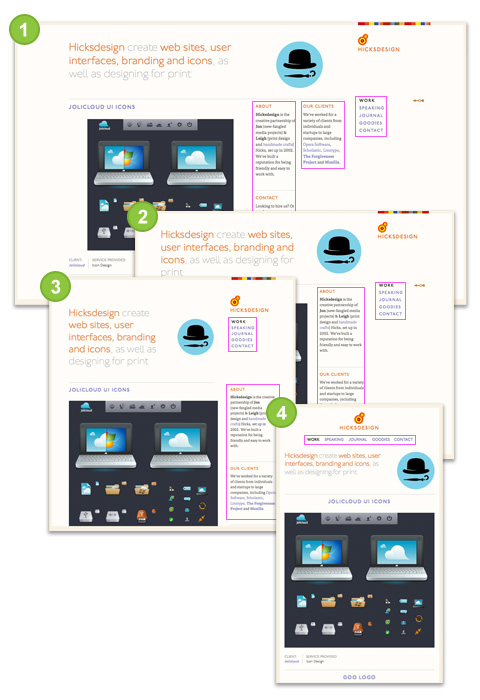
- Large size: 3 columns sidebar
- Smaller: 2 columns sidebar (the middle column drops to the left column)
- Even smaller: 1 column sidebar (the right column shift up below the logo)
- Smallest: no sidebar (logo & right column shift up and the other sidebar columns move below)
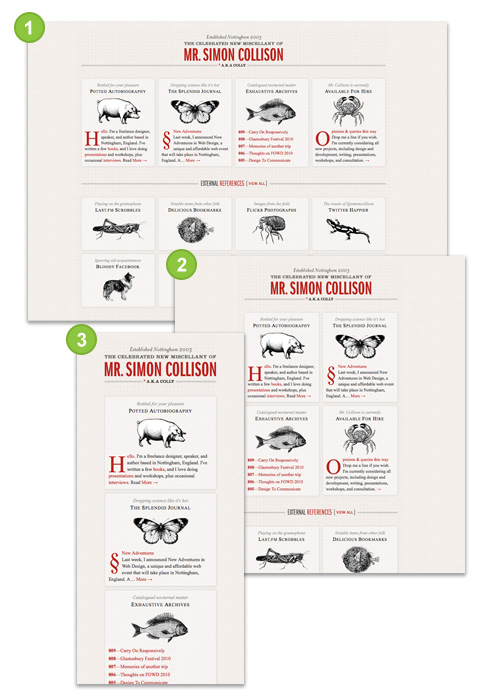
The layout switches between one column, 2 columns, and 4 columns depend on the viewing area of your browser.
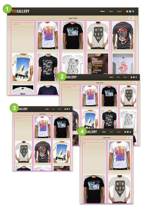
- Large size: navigation at the top, 1 row of pictures
- Medium size: navigation on the left side, 3 columns of pictures
- Small size: navigation at the top, no background image on logo, 3 columns of pictures

This one is very similar to previous example Colly, but the difference is the images of TeeGallery resize as the layout stretchs. The trick here is use relative percentage value instead of fixed pixel (ie. width=100%).
Conclusion
Keep in mind: having an optimized stylesheet for mobile devices doesn’t mean your site is optimized for mobile. To be truly optimized for mobile devices, your images and markups need to cut on the load size as well. Media queries are meant for design presentation, not optimization.