Tóm Tắt
Introduction to Swing Components in Java
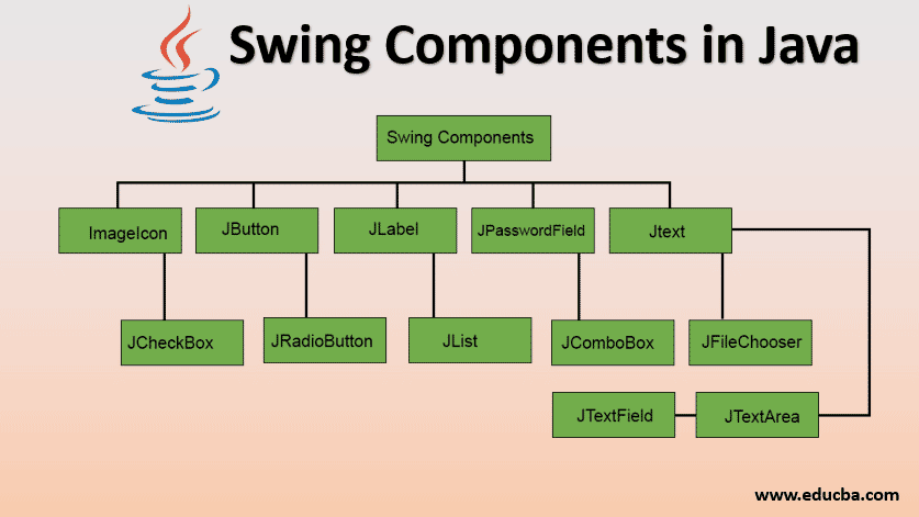
Swing components are the basic building blocks of an application. We know that Swing is a GUI widget toolkit for Java. Every application has some basic interactive interface for the user. For example, a button, check-box, radio-button, text-field, etc. These together form the components in Swing.
So, to summarise, Swing components are the interactive elements in a Java application. We will see various Swing Components in this article and see a few examples. Note that the examples are simple code snippets. You can use them in your application and tailor them to suit your application architecture.
Start Your Free Software Development Course
Web development, programming languages, Software testing & others
Top 13 Components of Swing in Java
Below are the different components of swing in java:
1. ImageIcon
The ImageIcon component creates an icon sized-image from an image residing at the source URL.
Example:
ImageIcon homeIcon = new ImageIcon("src/images/home.jpg");This returns an icon of a home button. The string parameter is the path at which the source image is present.
Note: We would be using this image icon in further examples.
2. JButton
JButton class is used to create a push-button on the UI. The button can contain some display text or image. It generates an event when clicked and double-clicked. A JButton can be implemented in the application by calling one of its constructors.
Example:
JButton okBtn = new JButton("Ok");This constructor returns a button with text Ok on it.
JButton homeBtn = new JButton(homeIcon);It returns a button with a homeIcon on it.
JButton btn2 = new JButton(homeIcon, "Home");It returns a button with the home icon and text Home.
3. JLabel
JLabel class is used to render a read-only text label or images on the UI. It does not generate any event.
Example:
JLabel textLbl = new JLabel("This is a text label.");This constructor returns a label with text.
JLabel imgLabel = new JLabel(homeIcon);It returns a label with a home icon.
4. JTextField
JTextField renders an editable single-line text box. A user can input non-formatted text in the box. To initialize the text field, call its constructor and pass an optional integer parameter to it. This parameter sets the width of the box measured by the number of columns. It does not limit the number of characters that can be input in the box.
Example:
JTextField txtBox = new JTextField(20);It renders a text box of 20 column width.
5. JTextArea
JTextArea class renders a multi-line text box. Similar to the JTextField, a user can input non-formatted text in the field. The constructor for JTextArea also expects two integer parameters which define the height and width of the text-area in columns. It does not restrict the number of characters that the user can input in the text-area.
Example:
JTextArea txtArea = new JTextArea("This text is default text for text area.", 5, 20);The above code renders a multi-line text-area of height 5 rows and width 20 columns, with default text initialized in the text-area.
6. JPasswordField
JPasswordField is a subclass of JTextField class. It renders a text-box that masks the user input text with bullet points. This is used for inserting passwords into the application.
Example:
JPasswordField pwdField = new JPasswordField(15);
var pwdValue = pwdField.getPassword();
It returns a password field of 15 column width. The getPassword method gets the value entered by the user.
7. JCheckBox
JCheckBox renders a check-box with a label. The check-box has two states – on/off. When selected, the state is on and a small tick is displayed in the box.
Example:
CheckBox chkBox = new JCheckBox("Show Help", true);It returns a checkbox with the label Show Help. Notice the second parameter in the constructor. It is a boolean value that indicates the default state of the check-box. True means the check-box is defaulted to on state.
8. JRadioButton
JRadioButton is used to render a group of radio buttons in the UI. A user can select one choice from the group.
Example:
ButtonGroup radioGroup = new ButtonGroup();
JRadioButton rb1 = new JRadioButton("Easy", true);
JRadioButton rb2 = new JRadioButton("Medium");
JRadioButton rb3 = new JRadioButton("Hard");
radioGroup.add(rb1);
radioGroup.add(rb2);
radioGroup.add(rb3);
The above code creates a button group and three radio button elements. All three elements are then added to the group. This ensures that only one option out of the available options in the group can be selected at a time. The default selected option is set to Easy.
9. JList
JList component renders a scrollable list of elements. A user can select a value or multiple values from the list. This select behavior is defined in the code by the developer.
Example:
DefaultListItem cityList = new DefaultListItem();
cityList.addElement("Mumbai"):
cityList.addElement("London"):
cityList.addElement("New York"):
cityList.addElement("Sydney"):
cityList.addElement("Tokyo"):
JList cities = new JList(cityList);
cities.setSelectionModel(ListSelectionModel.SINGLE_SELECTION);
The above code renders a list of cities with 5 items in the list. The selection restriction is set to SINGLE_SELECTION. If multiple selections is to be allowed, set the behavior to MULTIPLE_INTERVAL_SELECTION.
10. JComboBox
JComboBox class is used to render a dropdown of the list of options.
Example:
String[] cityStrings = { "Mumbai", "London", "New York", "Sydney", "Tokyo" };
JComboBox cities = new JComboBox(cityList);
cities.setSelectedIndex(3);
The default selected option can be specified through the setSelectedIndex method. The above code sets Sydney as the default selected option.
11. JFileChooser
JFileChooser class renders a file selection utility. This component lets a user select a file from the local system.
Example:
JFileChooser fileChooser = new JFileChooser();
JButton fileDialogBtn = new JButton("Select File");
fileDialogBtn.AddEventListner(new ActionListner(){
fileChooser.showOpenDialog();
})
var selectedFile = fileChooser.getSelectedFile();
The above code creates a file chooser dialog and attaches it to the button. The button click would open the file chooser dialog. The selected file is returned through the getSelectedFile method.
12. JTabbedPane
JTabbedPane is another very useful component that lets the user switch between tabs in an application. This is a highly useful utility as it lets the user browse more content without navigating to different pages.
Example:
JTabbedPane tabbedPane = new JTabbedPane();
tabbedPane.addTab("Tab 1", new JPanel());
tabbedPane.addTab("Tab 2", new JPanel());
The above code creates a two tabbed panel with headings Tab 1 and Tab 2.
13. JSlider
JSlider component displays a slider which the user can drag to change its value. The constructor takes three arguments – minimum value, maximum value, and initial value.
Example:
JSlider volumeSlider = new JSlider(0, 100, 50);
var volumeLevel = volumeSlider.getValue();
The above code creates a slider from 0 to 100 with an initial value set to 50. The value selected by the user is returned by the getValue method.
Conclusion
Now that you have got the gist of components in Swing, it is highly recommended to dive deeper and explore more. Swing components are fun to play around with and can help create some real cool applications. So, get your hands-on on these components by including them in your Swing application.
Recommended Articles
This is a guide to Swing Components in Java. Here we discuss the basic concept with top 13 useful components along with an example. You may also look at the following articles to learn more –
0
Shares
Share